
- Brand design
- Brand guidelines
- Marketing communications
- Visual identity
- Wayfinding
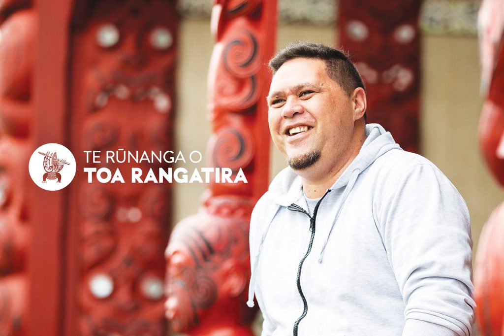
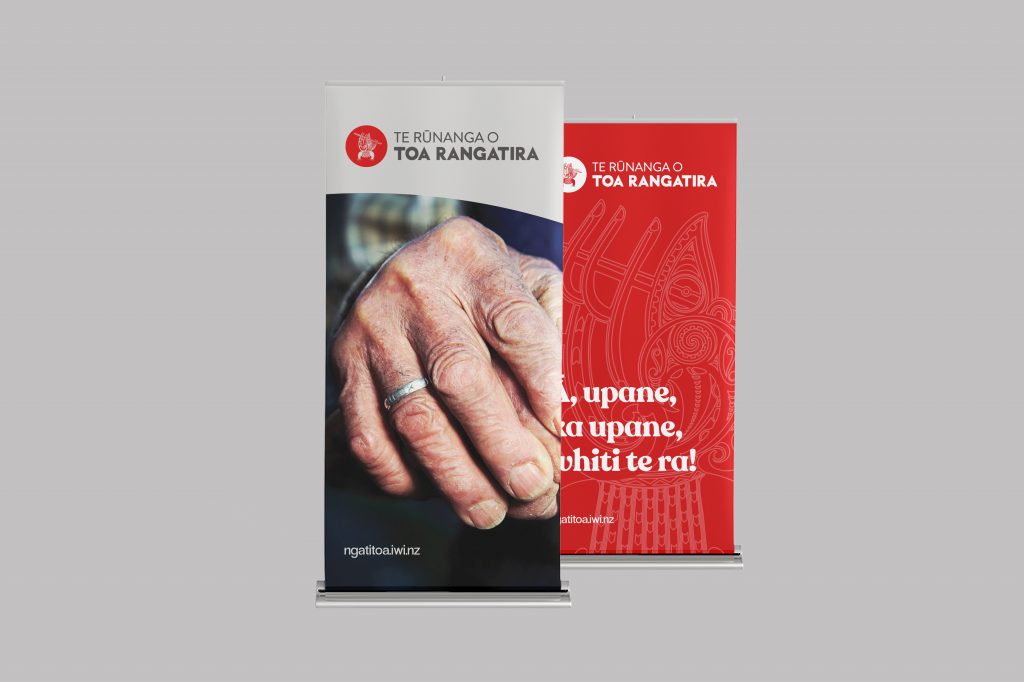
Te Rūnanga o Toa Rangatira is the commercial arm of the mighty Ngāti Toa iwi, the manawhenua for the Wellington, Porirua region.
The Rūnanga was on a mission. Post their Waitangi Tribunal settlement, their mandate was to regain all they had lost during the municipal land grabs through the early decades of the last century and then some.


With the added goal of building their people’s health, well-being, safety, self-respect and worth, Te Rūnanga o Toa Rangatira saw it as their role to provide as much as they could in every way possible. Education, health, financial security, property, retirement, environment – wrap-around services to support the iwi of Ngāti Toa through a lifetime and beyond – creating a robust platform from which the people of Toa Rangatira could flourish.
Driven by the desire to uplift a people, growth happened quickly. The Rūnunga added new services to the core operation through acquisitions, joint ventures, partnerships and a sub-brands structure. Local government, national government and the private sector as partners – it quickly became apparent that the organisation needed order and control to streamline it into the next phase of its existence.

Enter Voice to make sense of the above, creating an architecture for the master brand, sub-brand and commercial relationship structures. A graphic convention for logo expression, no matter the frame of the relationship, in a solid bilingual way that celebrated our new New Zealand.
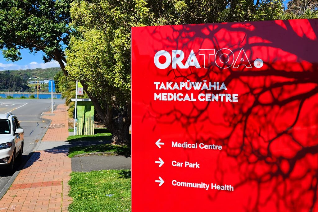
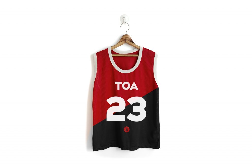
A refresh of the existing logo and the creation of a new visual identity. A new typeface, colour palette, corporate stationery and reporting documents, signage and wayfinding. Underpinned by easy-to-follow rules and regulations so that more people could get involved and achieve more things.
All the above ties back to one ever-changing, ever-growing master brand.